TL;DR (Too Long; Didn't Read)
Partful's homepage uses the pain of the status quo as its main narrative driver. It shows how outdated PDFs cause delays, errors, and support calls and then uses that friction to frame their 3D interactive catalog as the clear solution.
When building your homepage, don't lead with features, lead with friction. Show the pain your buyers already feel and the cost of staying the same. Once that pain feels real, your product becomes the natural next step rather than a forced pitch. Framing your solution against the old way builds urgency, it can set you apart, and helps buyers see the value without you having to oversell it.
Company Profile
Partful is a software platform that helps original equipment manufacturers (OEMs) modernise their parts catalogues and service documentation. On its homepage, it introduces itself as an “Interactive 3D Parts Catalog & Work Instructions” solution designed for OEMs. The service converts existing CAD and Bill of Materials data into interactive 3D exploded views, allowing dealers and customers to identify parts quickly and accurately.
What marketers can take from how Partful tells its story
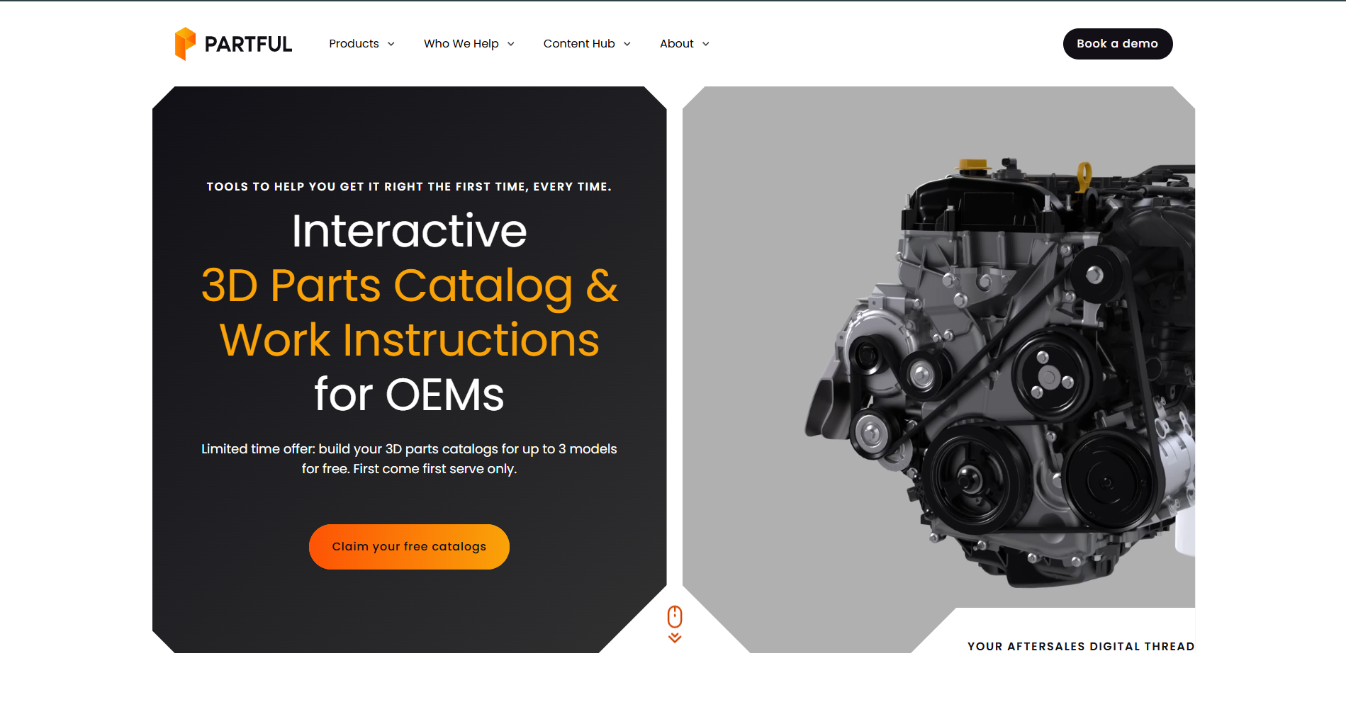
I am so used to seeing “big promises" in the hero sections of B2B tech companies. You know those big promises: increase revenue, cut costs, optimize your workflow. No productivity tool or workflow platform is going to increase a company’s revenue. At best, it saves someone an hour.
Partful doesn't start with a big promise, but with a very straightforward answer to “What we do”. I like the fact that they present what their customers will be able to do with their product right from the start in the hero section. There is a difference between leading with an outcome vs leading with a capability aka what their clients will be able to do with their product.
Leading with a capability makes sense for a technical audience because they want to understand how the tool works, what they can do with it, and the functional value it delivers before hearing about the broader business impact.
Although they later cover business outcomes on the homepage, this shows they understand that the page will likely be reviewed by multiple people in a purchasing group, a mix of technical and non-technical stakeholders who all play a role in approving the decision.
You might think that if several stakeholders will review your homepage, it makes sense to focus only on those who have the final “yes,” often the C-level executives. But that approach overlooks how buying decisions actually happen in B2B.
Instead, the goal should be to identify who will land on your homepage, what clues or signals each of them will look for, and weave those into the page, enough for each to see their priorities reflected without overwhelming anyone.
The best approach is to build around shared clarity, not stakeholder appeasement:
- Start with your A+ customer. Focus on the audience most unified by the same problem or goal, and centre the story primarily around them.
- Give each stakeholder a clear clue. Help everyone recognise their priorities without crowding the message (e.g.: executives: outcomes, ROI, risk reduction; technical teams: technical capability, integration depth)
- Keep one clear narrative. Make sure the homepage clearly shows who it’s for, why it matters, and why now.
- Use other assets to go deeper. Link to technical breakdowns, ROI explainers, or case studies for those who need more detail.
Choosing to differentiate from the right “competitor”
Although in a mature industry, they choose not to compare themselves to a competitor, but they challenge the status quo which are 2D diagrams and PDFs that get outdated fast which leads to many support calls and/or incorrect orders.
They are not afraid of going after this competitive alternative, they explain what OEMs can lose on multiple levels in multiple sections on their homepage.
If we look at the Problem Section, I found it interesting that they didn’t choose to show the internal pain points of the OEM’s teams dealing with PDF catalogs, but instead presented the pain points of their clients. They're actually showing a deep understanding of what’s really hurting OEMs’ business: their customers’ poor experience.
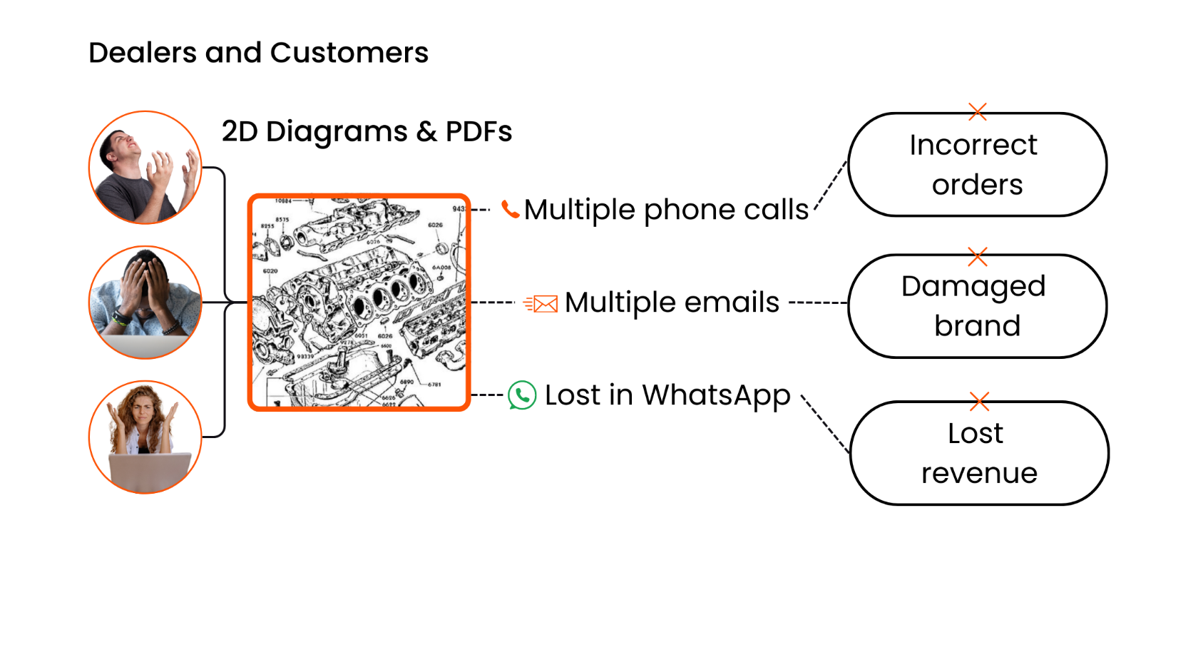
Partful frames the story from the end-user’s side — the dealers and customers who struggle to find the right parts or navigate outdated systems. But the real audience is still the OEM. When those users get stuck, it’s the OEM who pays the price in lost revenue, wasted time, and damaged trust.
By showing that connection, Partful keeps the message grounded in what OEMs actually care about: stronger aftersales performance and happier customers.
They use the data section below the problem to close the credibility gap most B2B websites leave open. After introducing the problem, OEMs losing revenue because of outdated aftersales tools, they prove it.
The stats below the diagram come from their own research, showing exactly how much revenue is lost and why. It shifts the message from “this is what we think you’re struggling with” to “we’ve quantified your reality.”
The one section I like the most is the “How it works” because they managed to show OEMs a before (competitive alternative) and after (their software) while SHOWING the product and it shows how it is different then the status quo.
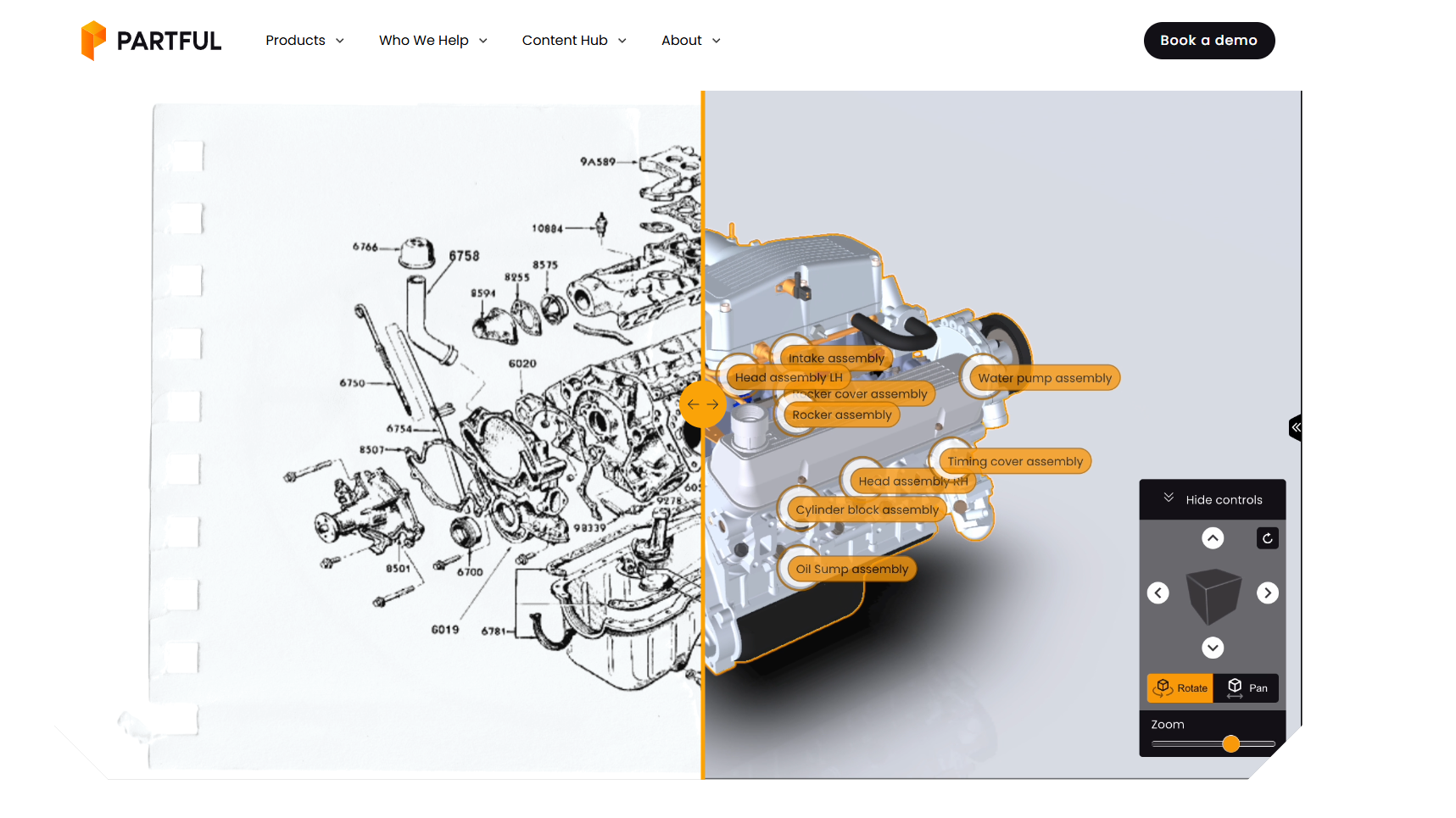
I’ve seen many B2B tech companies with impressive websites with no product insight, which is a shame, you should show your prospects what they are buying.
It’s one of the simplest but most overlooked ways to build trust
Some B2B companies rely on abstract graphics or mockups to suggest what their product does, rather than actually showing it. Buyers want to see what using your product actually looks like before asking for a demo.
Make the Old Way Hurt Before You Show the New One
Choosing to challenge the status quo instead of naming a competitor is a smart narrative move. It positions Partful not against another company, but against a shared frustration of outdated PDFs and static diagrams that waste time and lose money. They make sure to highlight that on the homepage.
It does a good job at showing what their product replaces. They make the old way feel painful before introducing the new one. You can almost sense the frustration of dealing with outdated PDFs and support calls, which makes their interactive 3D solution feel like a relief rather than just an upgrade.
If there’s one thing to take from this article, and you’re building your homepage right now, it’s this: make your audience feel the cost of inaction. Show the friction, the wasted time, the errors, and the frustration that define the old way of doing things.
Then make your product the turning point that brings clarity, speed, and confidence back into their process.

About the Author
Raluca is the the co-founder of Whale of the Web. She specializes in B2B website messaging and copywriting. In the past she helped B2B brands integrate content-first approaches to their online presence and marketing campaigns.